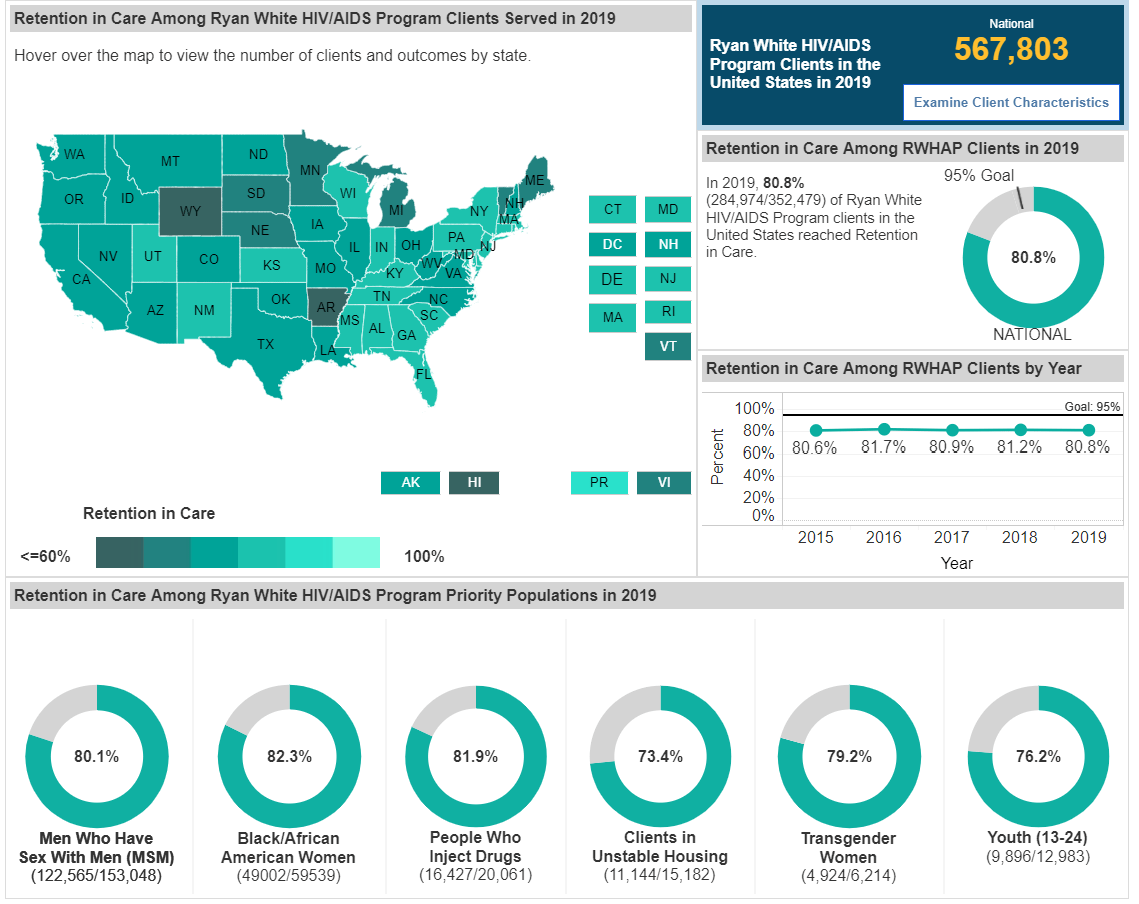
RWHAP Compass Dashboard: Tableau Visualization of Program and Client Data for the HRSA HAB Ryan White HIV/AIDS Program
5/2019-05-2021, ICF supporting RWHAP, https://data.hrsa.gov/topics/hiv-aids/compass-dashboard
Project Summary | My Role | Challenges | Highlights
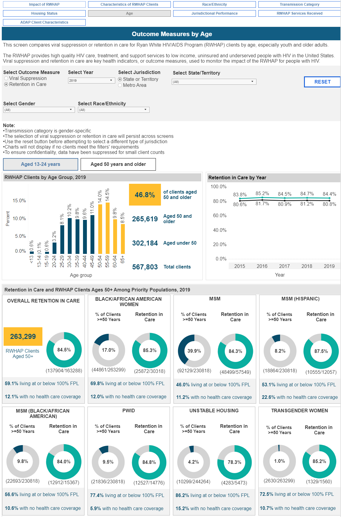
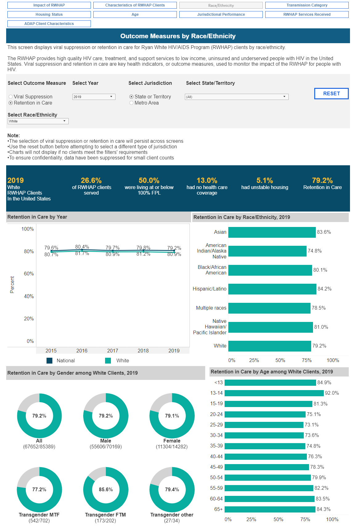
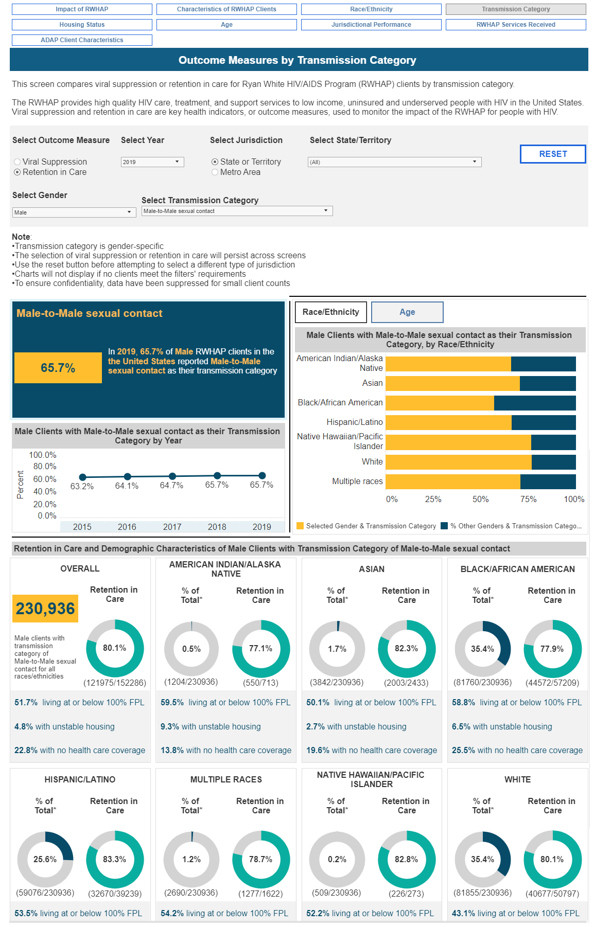
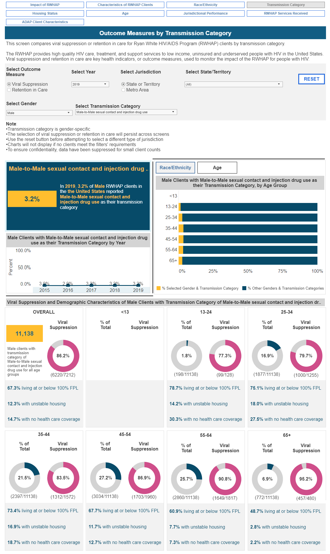
Project Summary
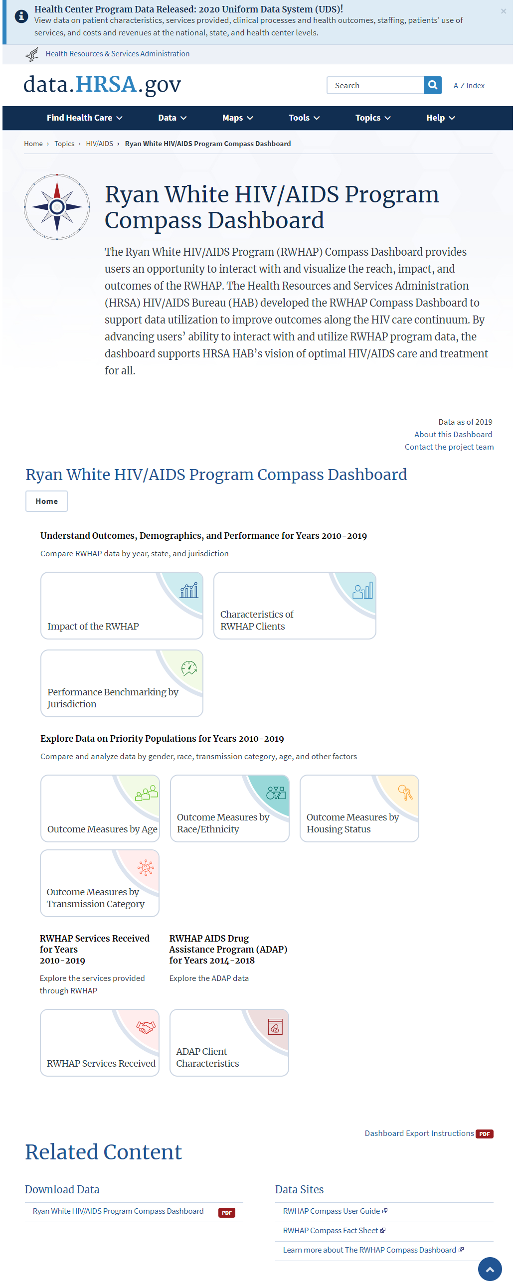
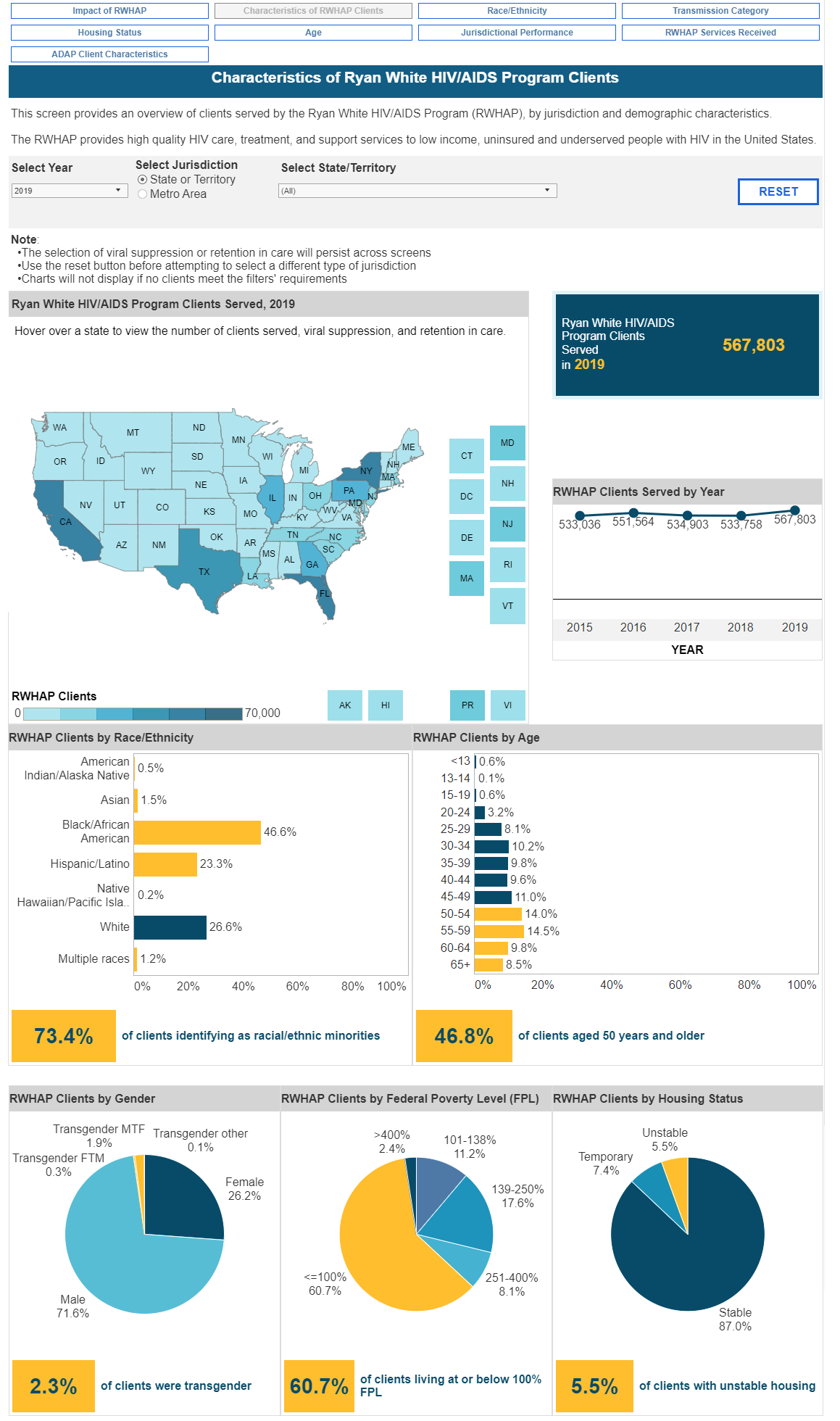
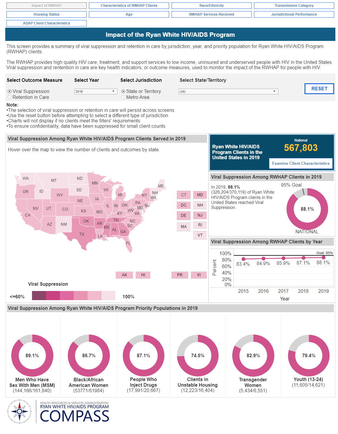
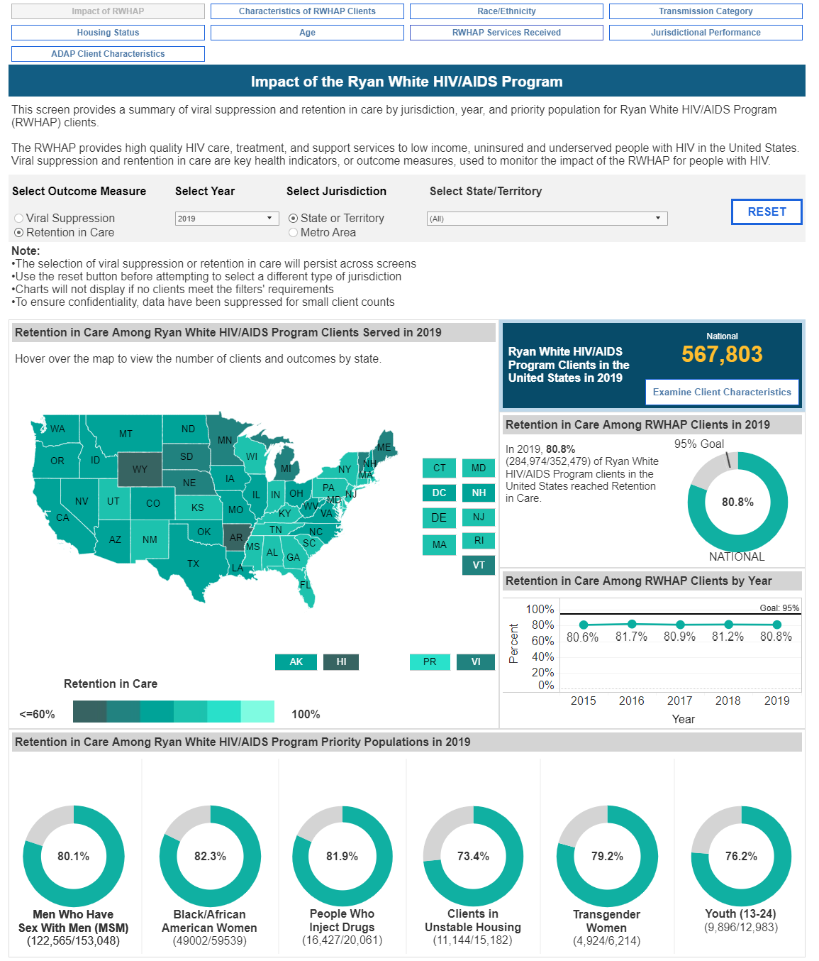
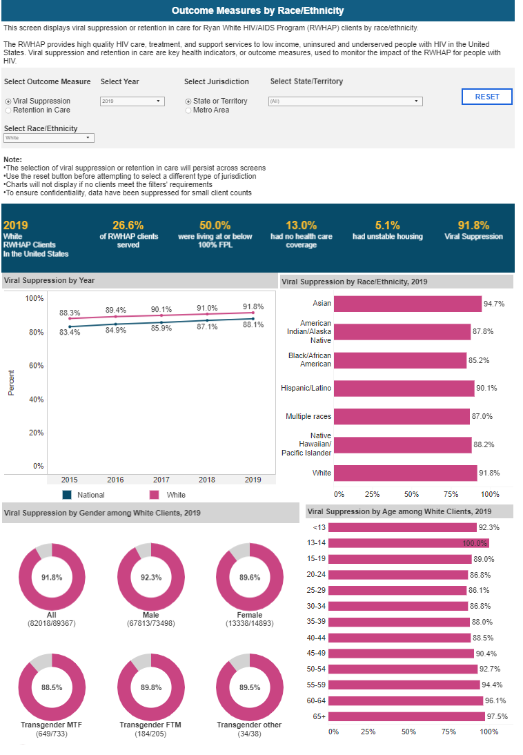
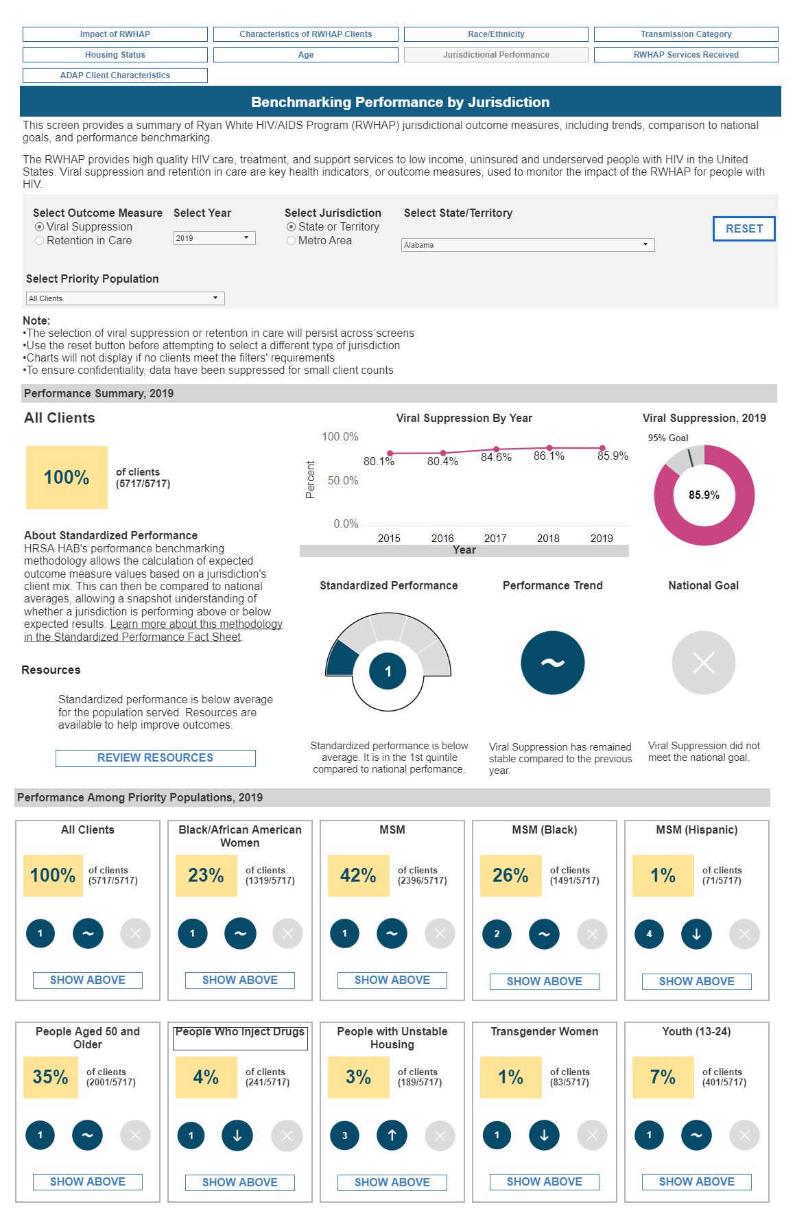
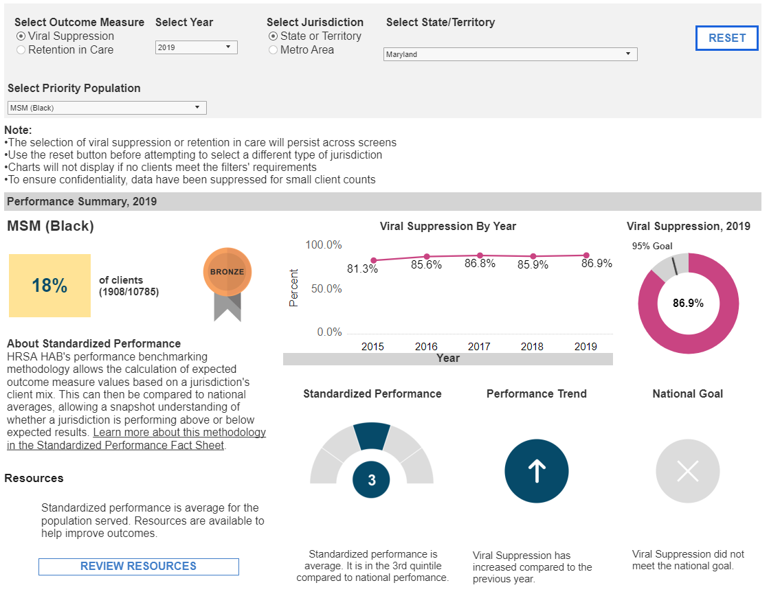
The Ryan White HIV/AIDS Program wanted a better way to share client demographics, program metrics, and provider outcomes. Originally this data was managed by the program and provided yearly in an annual report. Data analysis outside of the report presentation had to be requested and performed adhoc, causing time delays, questions about transparency, and additional work for program members. The Compass dashboard was designed to provide users an opportunity to interact with and visualize this information using Tableau’s dynamic filtering capabilities. Nine visualizations were developed to tell the story of the Program, its clients, and its impact.
My Role
- I served as a user-experience designer, evaluating and analyzing the data to understand what it contained, how data elements were related, and what types of visualizations were possible.
- I interviewed stakeholders from the program to understand how they use the data and to identify visualizations that would support their decision making and workflows.
- I engaged with potential public users by attending the HIV AIDs conference; presenting conceptual wireframes to spur conversation and feedback.
- I conducted workshops with potential users to facilitate participatory design.
- I designed the visualizations and coordinated with a graphics designer to ensure the colors were in alignment with client and USDWS guidance.
- Colors are tied to types of data, blue represents population data, while pink and teal represent the major outcome measures of the program (Viral Suppression and Retention in Care)
- I tested prototypes with users and integrated that feedback into the designs.
- I conducted Accessibility Testing, ensuring that the dashboards were as compliant as possible considering the constraints of Tableau.
Challenges
- The dashboards had to be created in Tableau and conform to strict formatting and style standards.
- There were issues in the way the data was collected that affected how it might be displayed. Some client data did not have proper relationships to other data resulting in different counts depending on how the data was analyzed (for example by person or by state or by provider). This issue had to be addressed with the client and decisions made on how to consistently handle these discrepancies to avoid any misleading representations of the data and provide a truthful consistent visualization across dashboards.
Highlights
- These dashboards allow users to compare two outcomes measures across ten dimensions: age, gender, ethnicity, services, transmission category, housing status, income level, drug usage, region, and provider; offering a far more robust way for analysts, program managers, and providers, to engage with the data.
- I researched and developed a guide for testers and developers to ensure accessibility compliance was optimized within the constraints of the platform, establishing standards that could be implemented and tested.

