SARS-CoV-2 Lineage Report (ACTIV) a Lineage Monitoring Tool NIH Leadership.
2021, ICF supporting NIH NCBI Virus
Project Summary | My Role | Challenges | Highlights
Project Summary
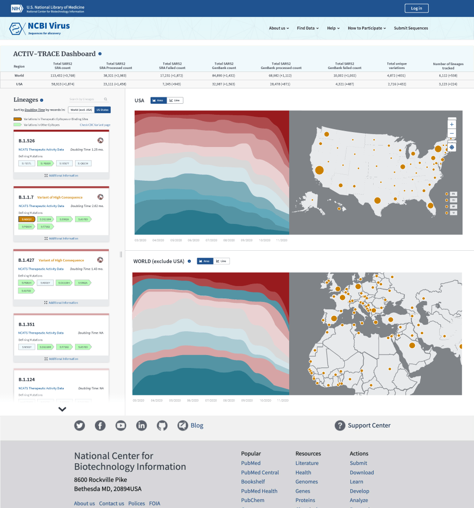
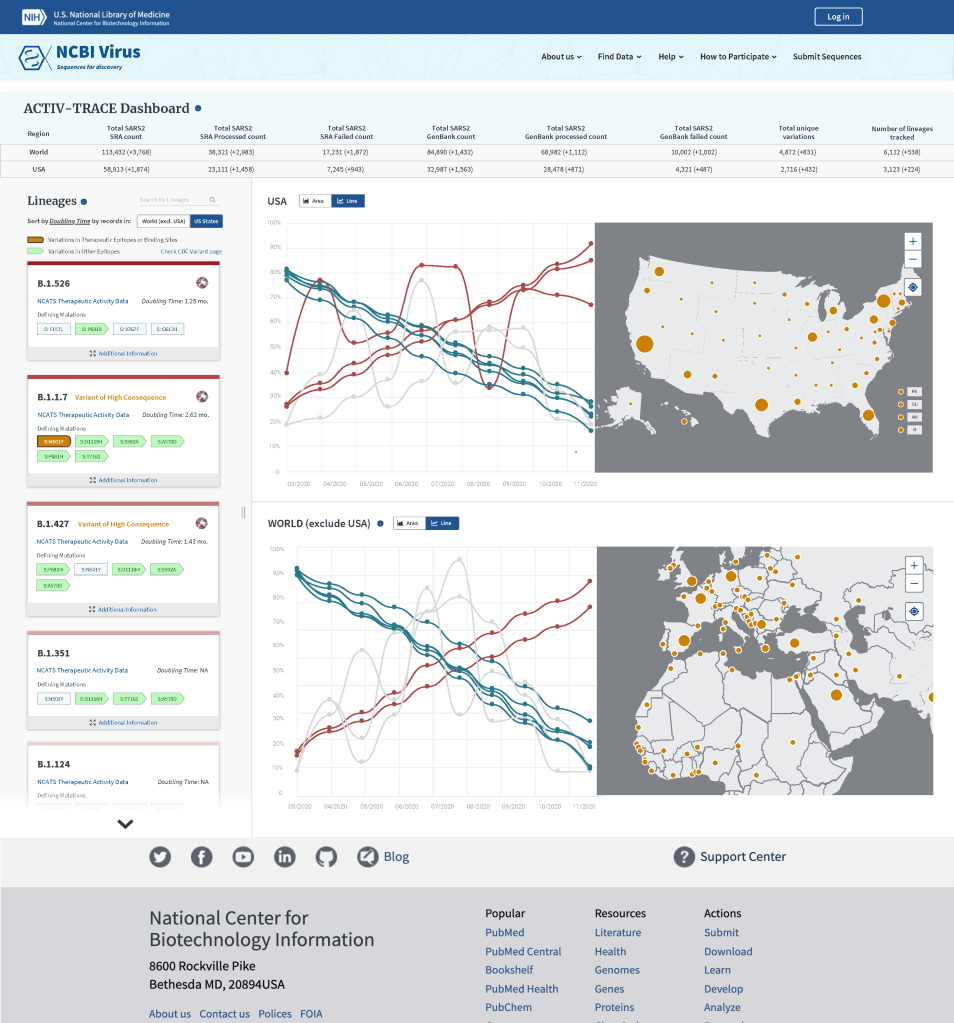
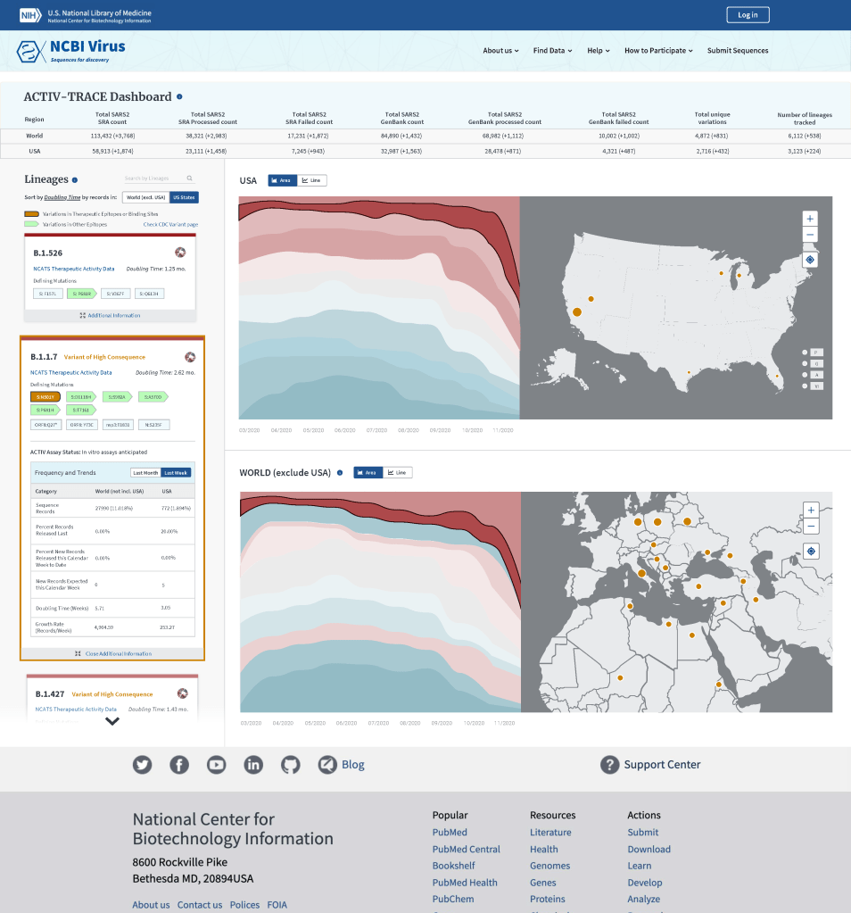
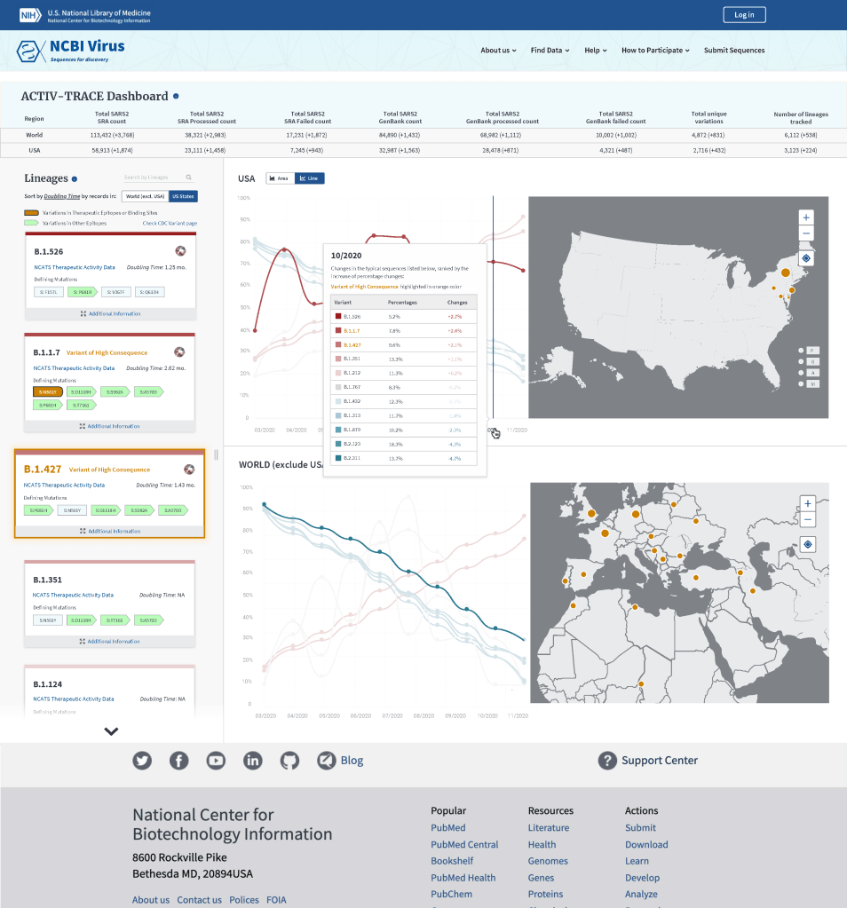
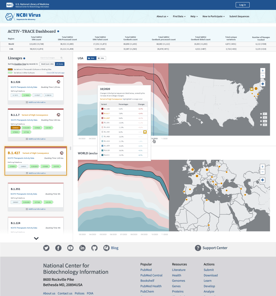
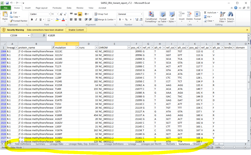
NCBI Leadership needed a method to track mutations and new lineages for SARS-CoV-2. Genomicists and data scientists began this work by collating data in excel from half a dozen systems across NIH. The NCBI Virus team was tasked with automating this report (to include establishing the infrastructure to gather data between systems) and make the report more user-friendly for leadership. Leadership desired to know which lineages were emerging, general trending of prevalence amount lineages, lineage prevalence in the World and US, understand which mutations where present in each lineage, and be able to trace back to data-sets supporting these findings. A future goal would be to link the lineage data to health outcomes view clinical trials and other initiatives.
Challenges
- Short turn around time to serve an evolving situation.
- Not all desired data available.
- Low availability of stakeholders.
- Highly visible project serving NIH leadership.
My Role:
- I worked with two genomcisits, the technical team, and a graphic designer to rapidly prototype an initial version of the report.
- Part of our discussion addressed how data would be sourced (since its currently manual). I strategized with the team to identify what information could reliably be designed into our first prototype and how future data might be integrated.
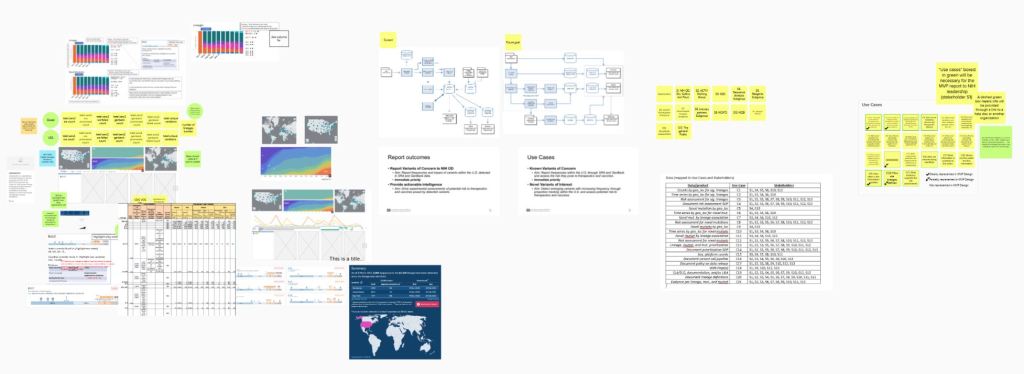
- I created an initial design white board and facilitated a two hour design session.
- I took the ideas generated in the design session and created low-fidelity wireframe frames which were then reviewed by the team and further refined.
- Our refined designs were enhanced by the graphics designer and presented to leadership for review and testing. I provided feedback on how to integrate their comments.
Highlights:
- Because of the many interactions in the design (and the limited availability of stakeholders) we created an animated prototype (video) that showed the interactions with a controlled data set. The video presentation allowed leadership to experience the intended interactions and see the affect on the data. This resulted in fewer questions from participants (than often occur with static, early prototypes), highly targeted, constructive feedback on the design, and yielded greater insights into user tasks and information needs.
- Our prototype convinced leadership that a data visualization was a better way to manage this data than cumbersome excel sheets
- The final product was built, based on my designs, after I left the project: https://www.ncbi.nlm.nih.gov/activ/

