Virus Variation Analysis Tool: Visualization of gene mutation data in samples of the SARS-Cov-2 genome, for NIH NCBI Virus.
1/2020-6/2021, ICF supporting NIH NCBI Virus, https://www.ncbi.nlm.nih.gov/labs/virus/vssi/#/scov2_snp (in development)
Project Summary | My Role | Challenges | Highlights

Design Evolution

Annotated Wireframes


Initial Release

Design Evolution

Design Evolution

Design Workshop Ideation Board
Project Summary
With the onset of SARS-CoV-2 pandemic genomic experts at NIH wanted better tools to identify and visualize mutations in SARS-CoV-2 genomic samples to assess trends in the evolution of the virus and more quickly identify new lineages. The Virus Variation Analysis tool (also called “Mutations in SRA”) was conceived as a way to address this challenge. A hackathon was conducted to rapidly produce a working prototype using a small data set. That prototype was provided to the NCBI Virus team to evolve and integrate into the Virus toolset.
My Role
- Worked closely with a genomics subject matter expert (and the product owner) to validate ideas and evolve the design.
- Created the conceptual wireframes and worked with a graphic designer to evolve them.
- Facilitated design sessions with the team and supported creation of acceptance criteria.
- Supported the Product Owner in the strategy and planning of development tasks.
- Worked closely with the developers to experiment with existing data sets and different visualization formats (for example, heat-map boxes versus bar charts, adjusting scaling, pre-set filtering for zooming, etc.) to optimize the visualizations.
- Designed wire-frame usability test and task-level analysis questions to obtain user feedback to inform designs.
Challenges
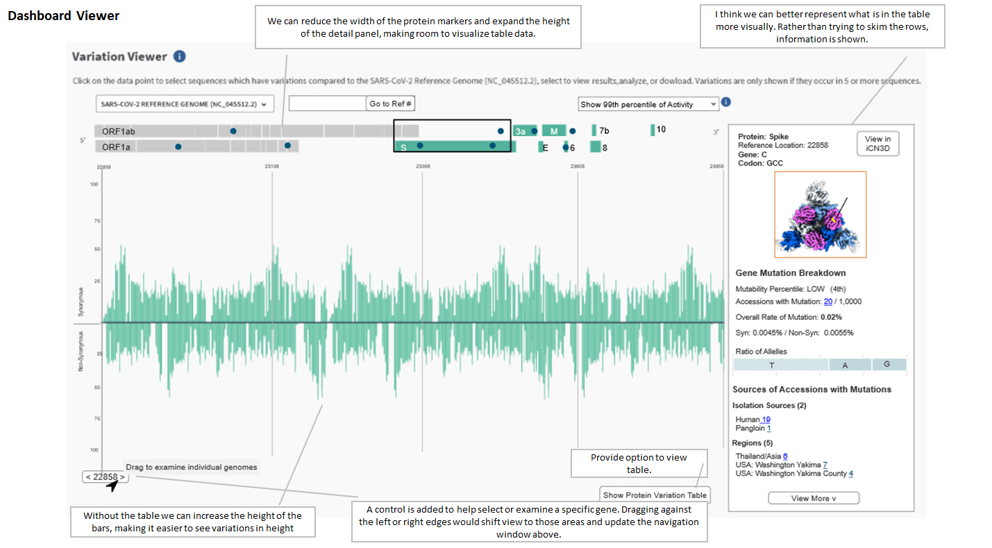
- The genome has 30,000 codons which is difficult to visualize in a screen shot. Some data will be obscured or would require significant left right scrolling (part of the initial hackathon solution).
- A single mutation point could include many accessions (a single genomic sample); the SARS-CoV-2 Dashboard focused on accession level data, so integrating the mutation data (such as using it to filter accession data or be filtered by accession data) had to be done carefully to clearly convey the one to many relationship and not confuse users.
- Mutation data was not represented in the existing accession tables (used by users to trigger downloads) so it might confuse users when passing filters between the Dashboard and download tables, this also necessitated the inclusion of tabular data below the Variation Viewer so it could be made available to users.
- NCBI had multiple data-sets that required integration to provide the data necessary for the Viewer, this meant that we had to design with sample data, so the impact of the full data set could not be known until development began.
Highlights
- I developed the metaphor of the microscope and encouraged that we design for specific levels of zoom, carefully deciding what should be obscured or exaggerated at each zoom level, this helped the team think critically about what information users are seeking at each level.
- I encouraged the use of percentiles to notify users of areas of change (either high or low) rather than relay on visual scanning, and to ensure users were aware of the distribution of change regardless of zoom level, by positioning notifications on the protein navigation bar.
- I developed the Reference Point information card to give users the ability to learn more about the accessions with mutations at a given point, rather than requiring them to scan the tabular data and giving them the control to hide the tabular data in order to reduce visual clutter.
 Human-Centered Design